CASE STUDY
Digital Navigator
Project: Reviews.com Redesign
Role: Product Designer
Goals: The project aimed to overhaul Reviews.com’s site experience to better serve its 2.5 million monthly visitors, 75% of whom access the site via mobile devices. The primary goal was to create a mobile-first, consistent, and scalable user experience that balances editorial content with transactional elements. My role involved leading the entire design process, from user flows to final prototyping.
Impact: The redesign led to a 44% increase in key performance metrics and a 3x higher post-click conversion rate, significantly improving user engagement and satisfaction.
The Problem
Challenge: The existing site was struggling with inconsistent user experiences, usability issues, and declining Google search rankings. These challenges were directly impacting user engagement and the overall health of the site.
Alignment: The problem was twofold—users needed a more trustworthy and user-friendly experience, while the business needed to enhance SEO performance and site usability to retain its audience.
Our Design Approach
UX Design Process
To tackle these challenges, I led a series of design sprints that focused on creativity, user needs, and technical constraints. The process involved:
Mission Statement & Values: Establishing a clear mission and core values to guide the design process.
Internal Audit: Conducting a thorough audit using historical data, user feedback, and industry best practices to identify areas for improvement.
Sample ‘How Might We’ Questions
How might we give the users more control?
How might we quickly instill trust in our review?
How might we allow our users to easily compare products?
How might we show only the available service providers?
By asking ourselves these questions, we were able to frame our challenges into opportunities.
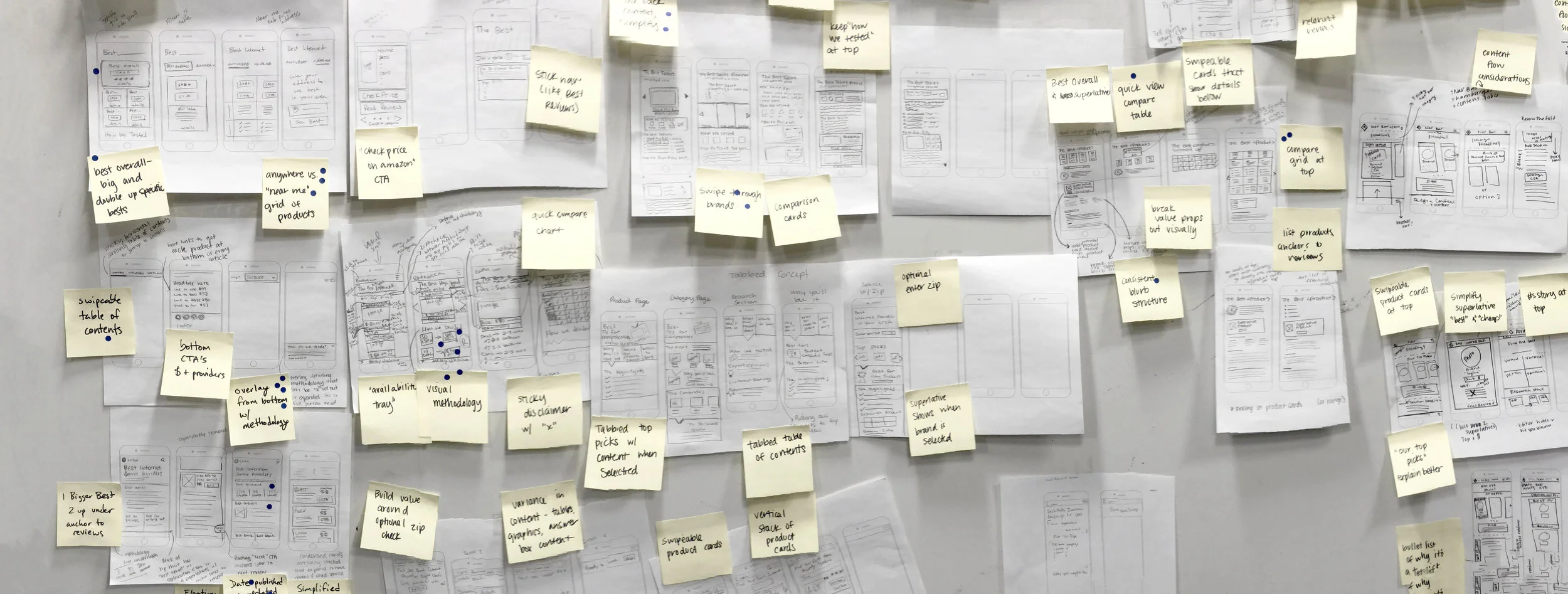
Sketches & Wireframes: Developing initial sketches and wireframes to explore solutions, followed by team voting on the best ideas.
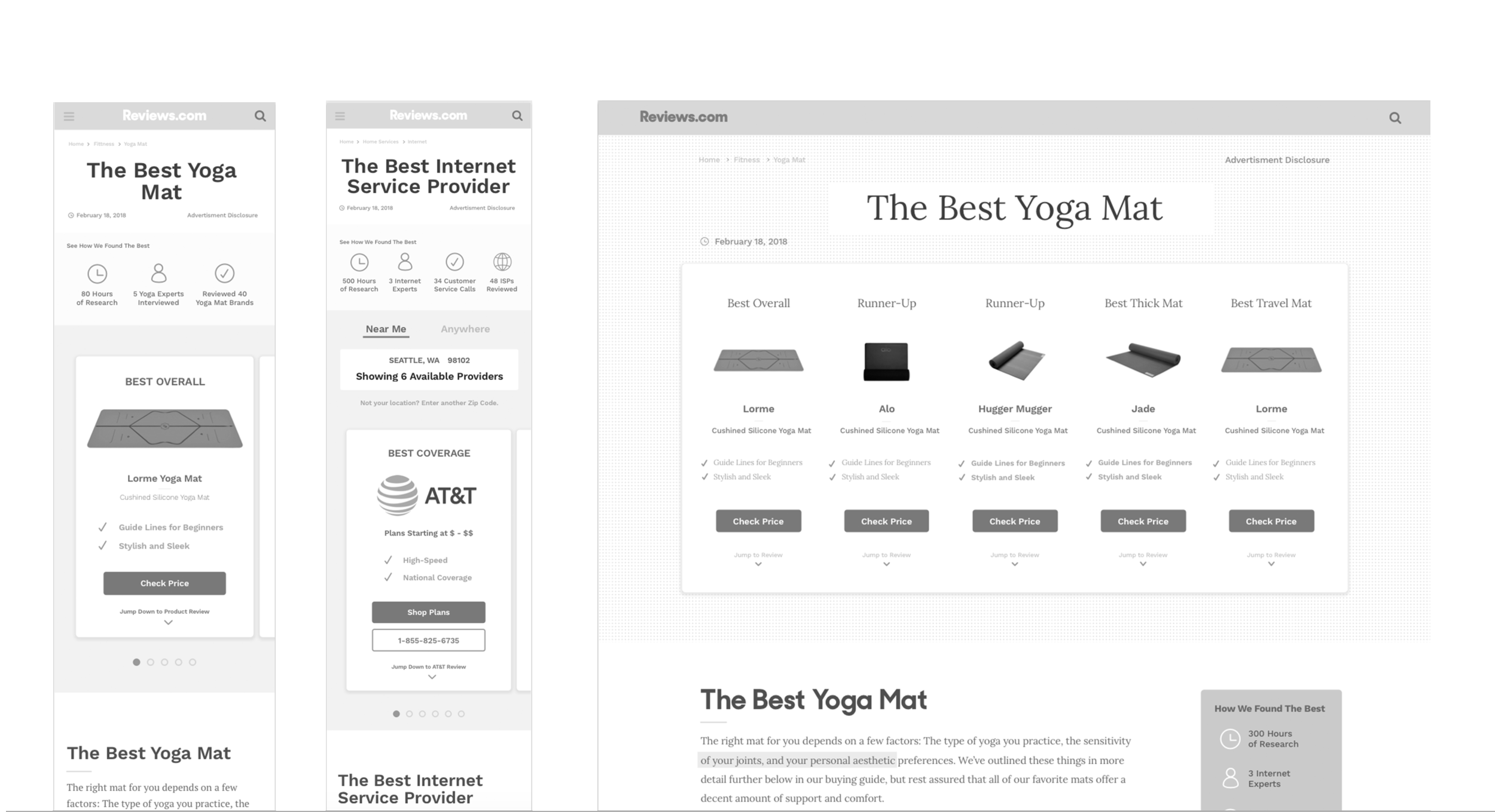
High-Fidelity Designs: Creating a series of design solutions that prioritized mobile usability and user control, including features like interactive tables of contents, comparison charts, and zip code tools to show available service providers.
HIGH-FIDELITY
Design Approach
Final Designs
The redesign resulted in a mobile-friendly, user-centric experience that successfully balanced editorial content with transactional elements. Key design features included:
Product Tables & Cards: Quick overviews of top picks.
Interactive Table of Contents: Enhanced user control.
Comparison Charts: Easy-to-read overviews of top picks.
Mobile-Friendly Content: Short, collapsible content for better mobile usability.
Trust Indicators: Clear explanations of how products were chosen.
Impact
The new design led to significant improvements:
A 44% increase in key performance metrics.
A 3x higher post-click conversion rate.
Positive user feedback and a boost in SEO rankings.
Reflections
Learnings
This project reinforced the importance of a user-centered design approach, particularly when balancing creativity with business and technical constraints. The experience deepened my understanding of mobile-first design principles and highlighted the value of iterative design processes. These learnings have influenced my approach to subsequent projects, emphasizing the need for ongoing testing, user feedback, and adaptability in design.
Solution: Trustworthy, consistent, user-friendly reviews website.
To quickly find solutions to these challenges, our team has begun a series of design sprints to plan, build, and test a new user experience for our reviews from the ground up.
User & Target Audience
Research Driven Consumers
Needs: Recommendations on Products or Services, Trustworthy Source
Considering the range of products and services we review, our individual users vary greatly. However, as a collective group, they are 20-30 year olds that are research driven, and in most cases, first time homeowners. They most likely have disposable income, giving them the flexibility to research, compare, and shop for the best products for them.
Bloggers
Needs: Trustworthy Source and Partnerships
Our traffic is primarily SEO driven and relies on external links to rank well on the Google search landscape. For that reason, our marketing team reaches out to bloggers to share our work. This is important because our pages must instill confidence, not only to our readers but also to influencers that might link to our site.
Team & Role
Product Designer
Currently, I am the sole product designer in a design overhaul for Reviews.com. I coordinate and own all design processes, including the user flows, branding, art direction, wire framing, user-interface, prototyping, user-testing, and leading communication with our Headquarters in Charlotte, NC.
I enjoy collaborating with a multi-disciplinary team. I am able to learn from my teammates and gain a broader understanding of our product. My team and I are working closely to develop a new user experience that is elegant and delightful, but more importantly practical and scalable.
Design Process
Mission Statement & Values
In order to ensure that our team shares the same vision and goals for Reviews.com, we developed a mission statement and a set of core values to advise our product road map.
Mission Statement: To deliver helpful, thorough reviews in a user-friendly, scalable fashion, that leave our users feeling well-informed and ready to make a decision.
Core Values: Helpful, Trusted, Approachable, Resourceful
Internal Audit
In order to find what is and what is not working within our review pages, our team leveraged historical data, user feedback, industry best practices, and a healthy dose of instinct to start uncovering areas where we can improve our pages.
Sketches and Wireframes
After discovering the areas, in which we needed to improve, the team began to sketch out and vote on the solutions to the problems we found.
Product Table & Cards
Quick Glance at our Top Picks
How We Found the Best
Instill Trust and Show our Research
Interactive Table of Contents
Give User More Control
Mobile Friendly Content
Short, Concise, Collapsable Content
Visual Cues and CTAs
Branding Elements
Comparison Chart
Quick Overview of all Top Picks
Guide & FAQ
Help Users Make an Informed Decision
Zip Code Tool
Show Only the Available Service Providers
VERSION 1.0
The Best Yoga Mats Review
VERSION 1.0
The Best High Speed Internet Providers Review
Outcome & Next Steps
Success Metrics
When testing our product, I measure and rely on multiple success metrics. Some of these include on-site click through rate (CTR), click through rate by partner/product (pCTR), time-on site, and post-click conversion (PCC) ). These metrics give me an idea of what our users are doing, thinking, and purchasing through our site, as well as their overall satisfaction with the product.
Device Type
In order to better understand our users, I often segment the data into device type. The majority of our traffic comes from mobile devices, which is why one of my main goals with this redesign is to provide our users with a better mobile experience.
Test Results
As of late March 2018, these new user experiences are still being tested and developed. However, preliminary data has reached statistical significance and shows positive gains (+44%) across both the Yoga Mat category test and the High Speed Internet Service Providers test. Post Click Conversion is 3x higher on the new experience.
Next Steps
These test results show substantial gains for our team. I am incredibly excited and proud to continue to work on this initiative. Our next steps include designing the home page, new review pages, our blog, and other cross linking initiatives.
LET'S CHAT!
Have any questions?
If you would like to learn more about this project or have any additional questions, feel free to contact me.


